

| home | services | portfolio | about us | contact |

|
GE Johnson Construction
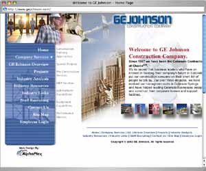
design objectivesGE Johnson needed a facelift. They are a major Colorado-based construction company, and needed a web presence that reflected their stature. design challengesThe existing navigation was difficult and confusing. The new site needed to be much easier to use. There wasnt much potential to categorize the links, and to radically change the method for navigating the site would possibly be a deterrent to existing and new site visitors. A straightforward, left side navigation scheme, similar to many existing sports-oriented sites was utilized. of note …GE Jonson had an impressive collection of photography at their disposal. From their multitude of construction projects, to footage taken to create their marketing materials, there were many quality images available to the designer. Many companies do not have this kind of imagery at hand, and this made the project a special treat. A collage was assembled, and various aspects of their photography were used throughout the site, giving it a much richer and more dynamic feel than many other web sites. This, in addition to comprehensive and intuitive content, delivered GE Johnson a top award in their industry for the web site. |
home |
services |
portfolio |
about us |
contact
© 2009 All Rights Reserved. Gas Giant Design