|
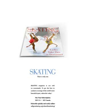
Skating Magazine ad

of note …
Typically, ads for SKATING magazine had been designed featuring multiple cover images and an order form which took up much of the space. In a "let's try this and see what they think" moment, I designed a more modern looking ad. The drastically different approach was well liked, and the addition of a new website made it possible to not only take subscriptions online, it allowed for the removal of the order form from the ad. This opened up the opportunity for this new design layout.
|


